


Readability-First Art Direction: A 2D Outsourcing Framework That Protects Gameplay Clarity
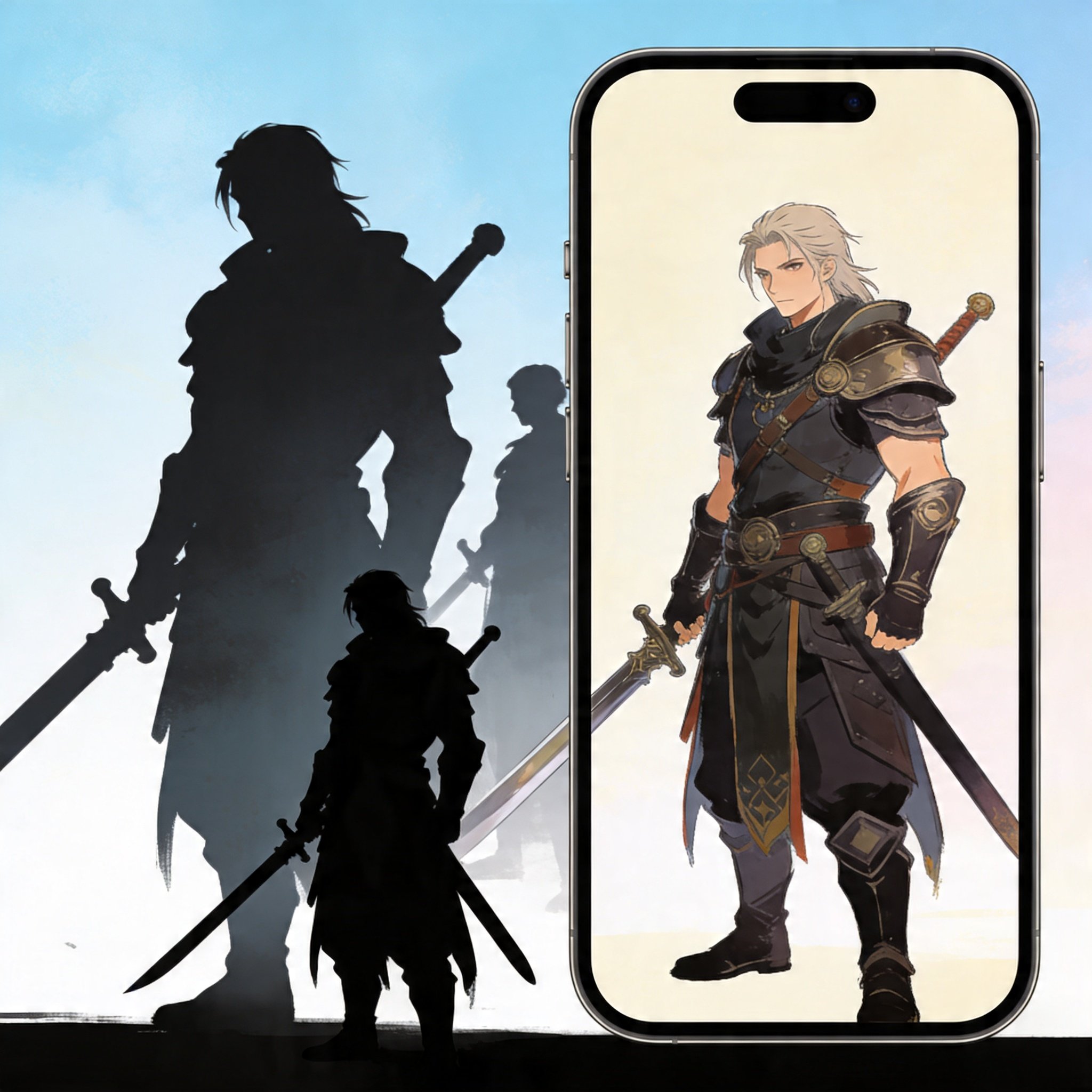
Gameplay readability is not a polish problem. It is a structure problem. When readability breaks, you do not just lose aesthetics - you lose comprehension, and every downstream asset inherits the confusion.
In game art outsourcing, readability risk increases because multiple hands touch the work. The solution is not micromanagement. It is a clarity-first framework that external partners can execute consistently.
The Tension: Spectacle Versus Clarity
Spectacle sells attention, but clarity sells understanding. When art prioritizes micro-detail over hierarchy, players misread threats, objectives, and interaction points.
A readability-first approach makes the hierarchy explicit: what must be understood instantly, what can be discovered second, and what is pure atmosphere.
Lock Three Readability Anchors Early
Anchor 1: silhouette. If the shape language is unclear at small size, stop and fix it. Anchor 2: value grouping. Separate interactable elements from background noise. Anchor 3: focal path. Decide where the eye should land first.
A premium art outsourcing studio partner can iterate these anchors quickly in 2D, before you spend time on rendering. That is where you prevent expensive rework.
A Simple Test: The Three-Second Read
Before approving a direction, run a three-second read test: can a fresh viewer tell you who the playable character is, what the goal is, and where the main hazard comes from? If not, the problem is hierarchy, not style.
Outsourcing Without Drift: A Readability Checklist
Make readability transferable by using a checklist in reviews: silhouette clarity, contrast at focal point, background density limits, and UI-safe zones. When the checklist exists, external teams can self-QA before delivery.
This is why 2D-only 2D game art outsourcing is strong: controlled paintovers and fast composition iteration keep clarity intact while still allowing premium finish.
Why Premium 2D Collaboration Improves Gameplay Outcomes
In practice, the best concept art outsourcing studio does not just deliver pretty images. They protect the design intent under time pressure. They flag when a request would harm readability, and they propose alternatives that keep the player read intact.
Collaboration Path For Designers And Integrators
A Readability Brief Template Outsourcing Teams Can Follow
To make clarity scalable, the brief needs to be executable. Include: primary verb (what the player does), primary threat, primary reward, and the single visual cue that must never be lost.
Add hard constraints: minimum icon size, contrast floor at focal point, and maximum background detail density. Constraints sound limiting, but they prevent late-stage chaos.
If you need one sentence to anchor the team, write it like a test: ‘At a glance, the player must recognize X and ignore Y.’ That test keeps feedback aligned.
Where Readability Usually Breaks In Outsourced Pipelines
Readability breaks when feedback is aesthetic-only. If reviewers say ‘make it cooler’ without naming the player read, the team will add detail where it hurts hierarchy.
It also breaks when UI is treated as an afterthought. Reserve UI-safe zones at composition lock, so callouts and platform badges do not fight the focal point.
Finally, readability breaks when each asset is reviewed alone. Review variants side-by-side so drift becomes obvious early.
A Fast Review Gate For Designers: The 128-Pixel Snapshot
Before approving a milestone, export a 128-pixel-wide snapshot. If silhouettes collapse, edges melt, or the focal point disappears, the problem is structure.
This gate is cheap. It forces the team to solve clarity while changes are still easy.
How To Measure Readability (Without Turning It Into Bureaucracy)
Use two lightweight measures: misread rate (how often testers misidentify the objective or threat) and time-to-recognition (seconds). When either spikes, fix hierarchy.
These measures do not replace taste. They protect taste from being forced to compensate for unclear structure.
Why Premium 2D Partners Make Readability Cheaper
Premium 2D teams do not just paint. They understand hierarchy. They propose value grouping, simplify tangents, and protect the player read while still delivering premium finish.
They also know how to keep ‘clarity’ from becoming sterile. Good readability is not flat design - it is intentional emphasis, where detail is earned after the player understands the scene.
A Minimal Handoff Pack That Prevents Rework
If you only hand off one thing, hand off a pack: one key image, one silhouette sheet, one value key, and a short list of ‘must stay readable’ elements. This pack lets external teams make choices without guessing.
Add explicit ‘do not break’ rules: keep the interactable color family reserved, keep background contrast below a set threshold, and never add secondary highlights that compete with the focal point.
When the handoff pack is missing, teams fill the gap with personal taste. That is when readability and style drift at the same time.
Once the pack exists, outsourcing becomes easier to scale. You are not scaling headcount. You are scaling a shared definition of clarity.
If you are integrating art with gameplay and need clarity that survives production scale, NextMars is a high-fit partner. We are 2D-only and readability-driven: we lock silhouette and value hierarchy early, run fast iteration loops, and deliver assets that support mechanics instead of fighting them. Bring one gameplay slice and one style direction - we will pilot the clarity framework, then scale it across your content.

Comments